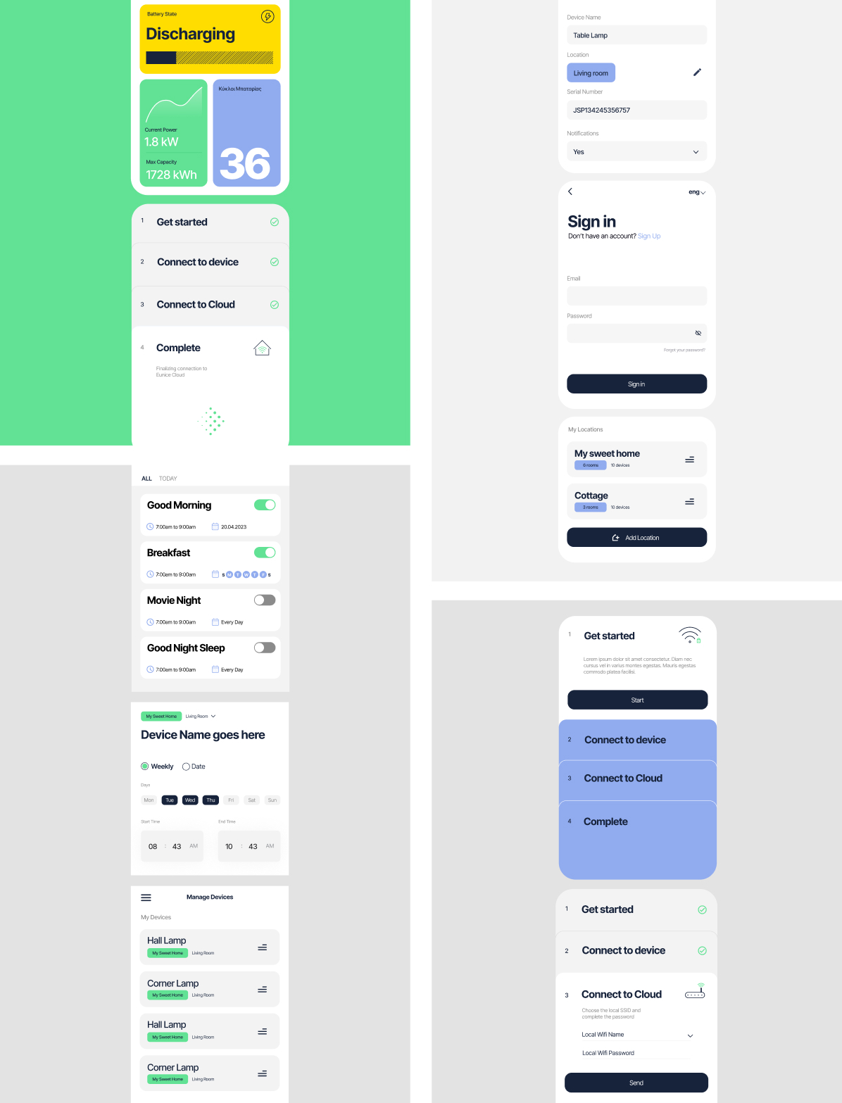
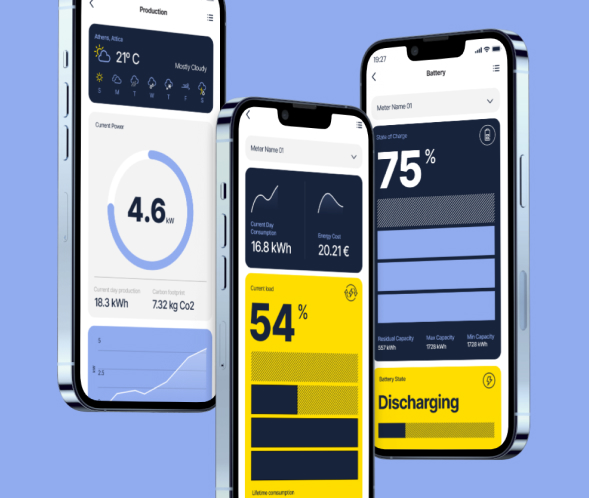
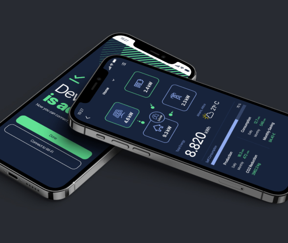
THE OBJECTIVE
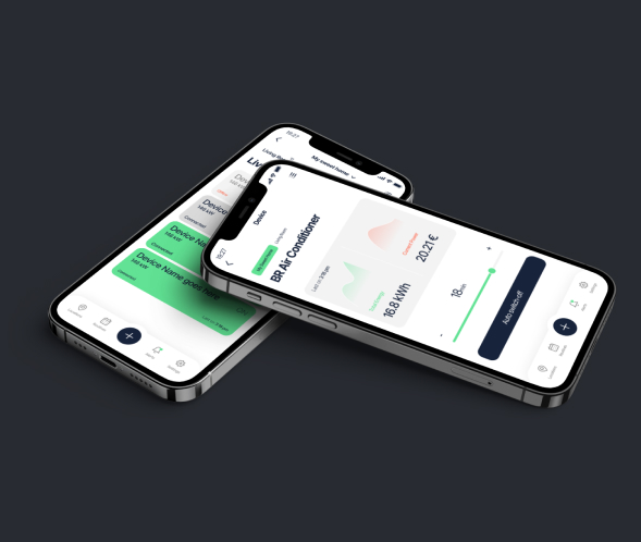
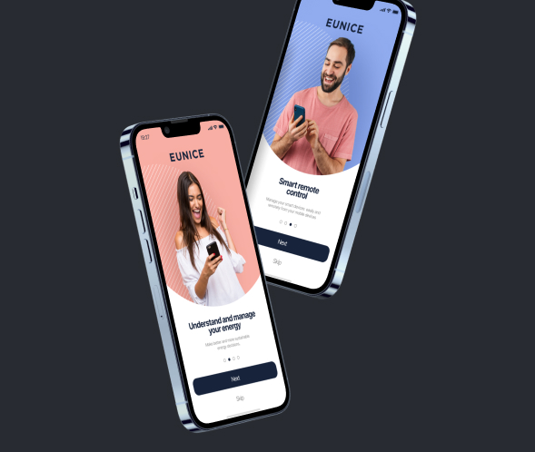
In this project, our primary objective was to create an app interface that prioritizes user-friendliness, ease of use and high functionality. We strived to ensure data communication through intuitive design, visualizing energy readings in a clear and easily understandable manner that empowers users to manage their energy efficiently.
THE SOLUTION
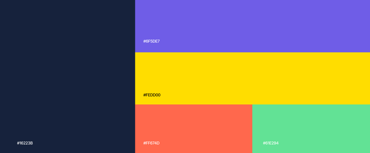
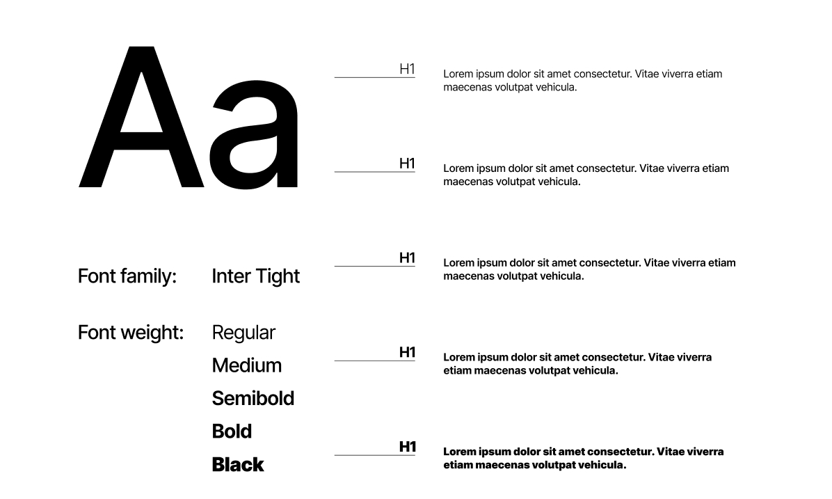
Our UX design purposefully visualizes the flow of energy to promote user-friendliness. We created infographics to ensure energy readings are easily comprehensible, promoting clear data communication. Our color scheme incorporates two EUNICE brand colors and three newly selected ones: a fresh violet hue that works great in digital imaging, harmonizing with the brand while standing out independently and a refreshing twist on the traditional green/red representation for on/off visuals, infused with a hint of neon. The font choice enhances UI friendliness, creating in an app interface that is both intuitive and aesthetically pleasing.