
Breathing life into Notia Medcare’s visual identity
How our redesign approach bridged the clinic’s mission with the values of longevity and modern wellness.

Background
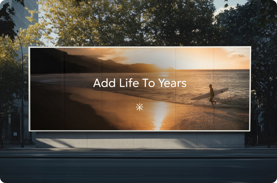
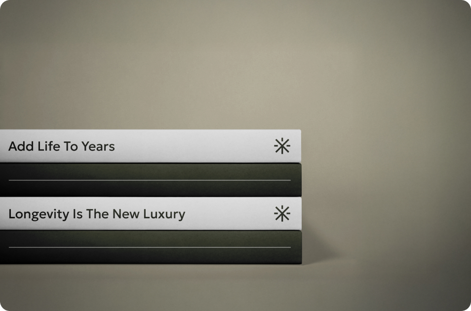
Born from a vision to extend healthy lifetimes, Notia Medcare is the first medical clinic in Greece that is dedicated to longevity and proactive health. Based in the southern suburbs of Athens, they offer advanced medical treatments, personalized programs, and holistic wellness therapies to create a nurturing and revitalizing environment. Inspired by their guiding mantra “Add life to years”, Notia Medcare’s mission is to help people live healthier, fuller lives at every stage.
The Challenge
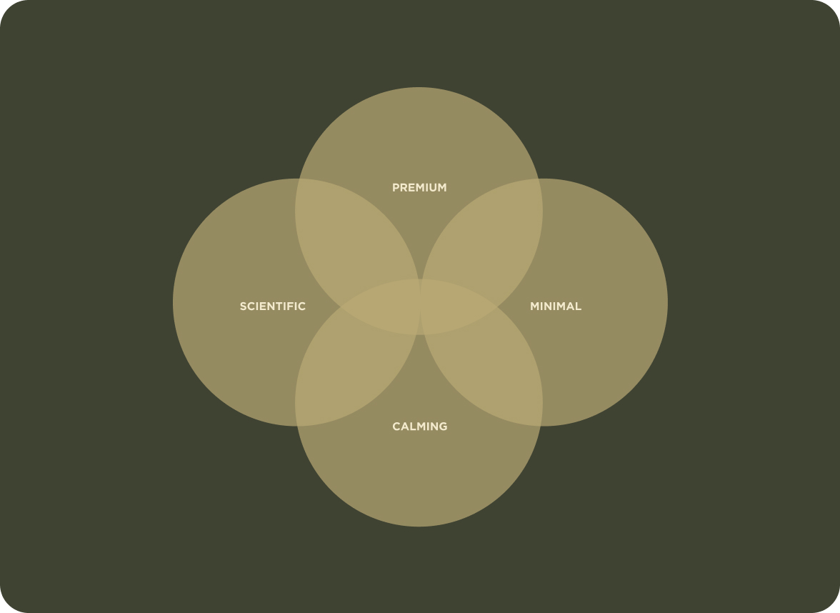
As Notia Medcare grew and evolved, its visual identity no longer aligned with its innovative approach to longevity and wellness, or reflected its contemporary spirit and the sense of luxury that patients experienced. We needed to breathe new life into the brand, by creating a fresh visual identity that could communicate the clinic’s values of innovation and expertise, while also creating a space of warmth, privacy, and profound trust.


Our approach to logo design
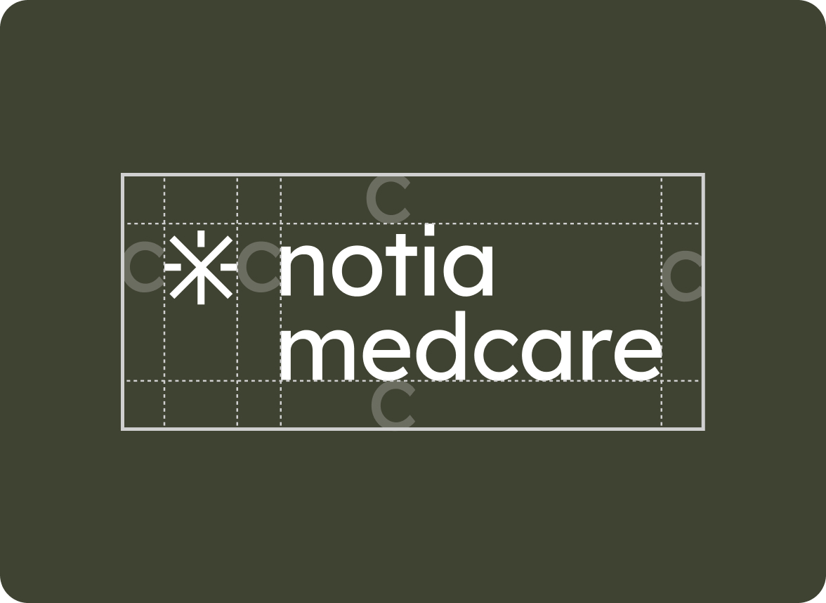
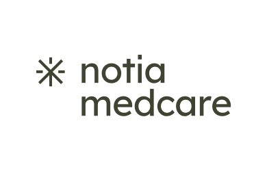
Our creative journey began with crafting the new logotype. We set out to create a design that tells a whole story by combining all the elements that make Notia Medcare what it is today.
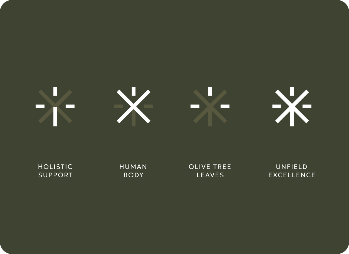
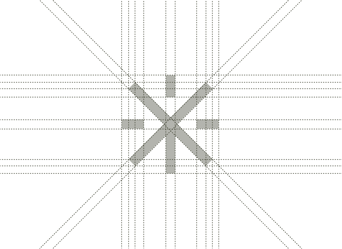
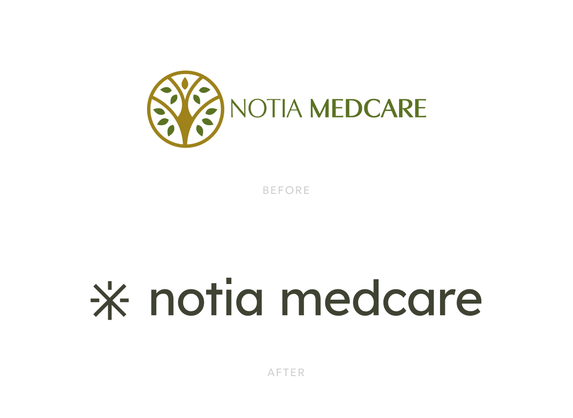
Redesigning the tree of life from the old logo with a minimal, contemporary approach, we highlighted its universal symbolism of longevity and resilience. We drew inspiration from the olive tree and the sun that honor the clinic’s Greek roots and Mediterranean character, while also incorporating the human figure, a reminder of the clinic’s people-oriented nature. An upward-pointing arrow completes the final design, expressing progress and the drive to keep moving forward.
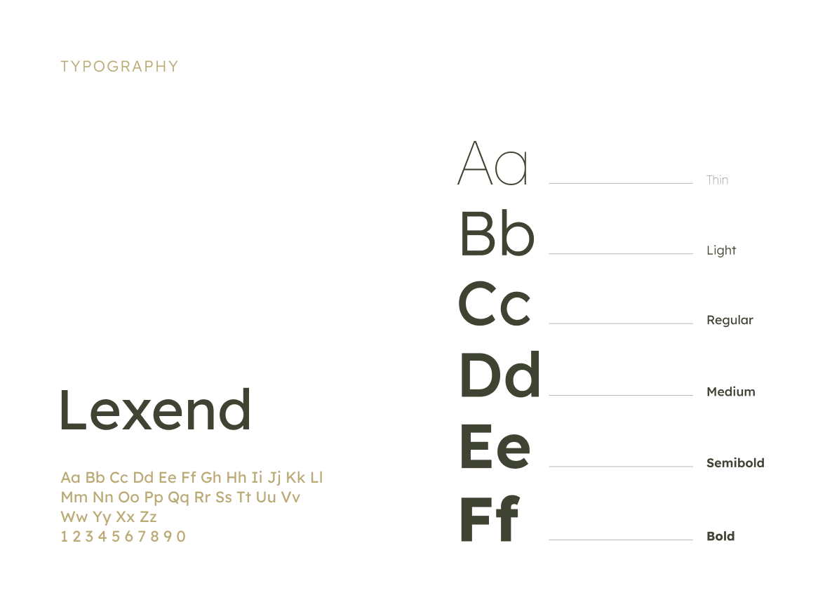
For the logo’s typography, we chose the Lexend font family for its modern, clean lines that make the text approachable and easy to read, while also conveying trust and professionalism.
Creating the visual language
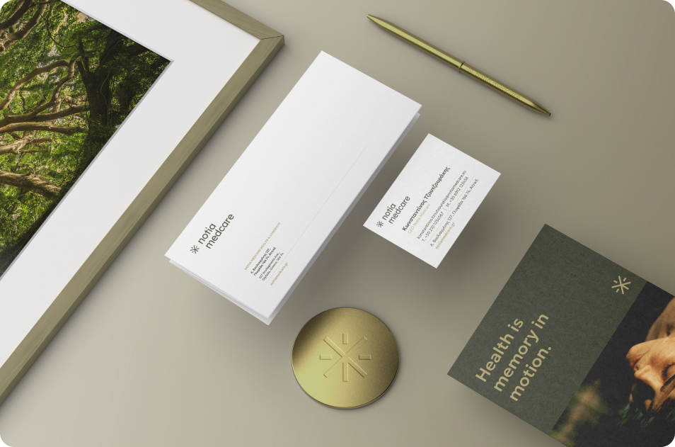
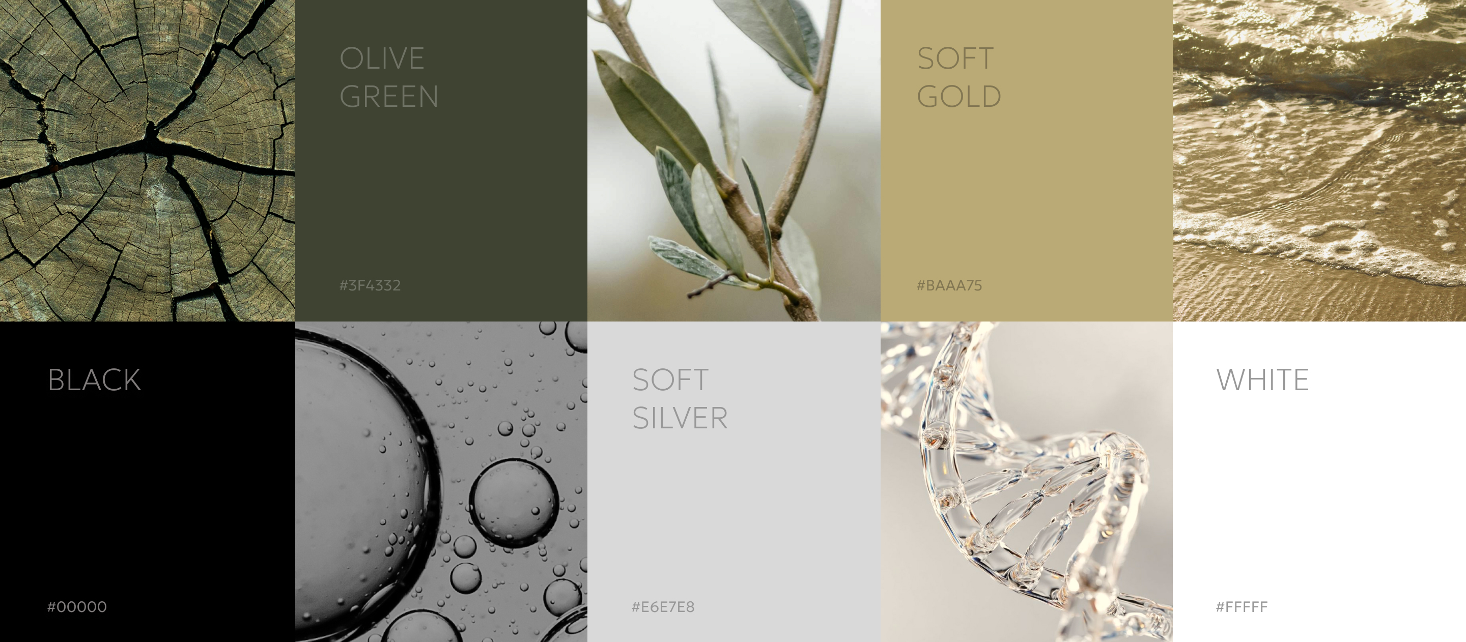
To bring the new identity to life, we developed a contemporary color palette as a tool to evoke emotion. A bold olive green was chosen to symbolize the spirit of Mediterranean landscapes and the promise of vitality. The elegant gold accent adds a touch of warmth and luxury, while a gentle silver tone represents innovation and professionalism. Black and white complete the palette, providing striking contrast and adaptability across every brand application.
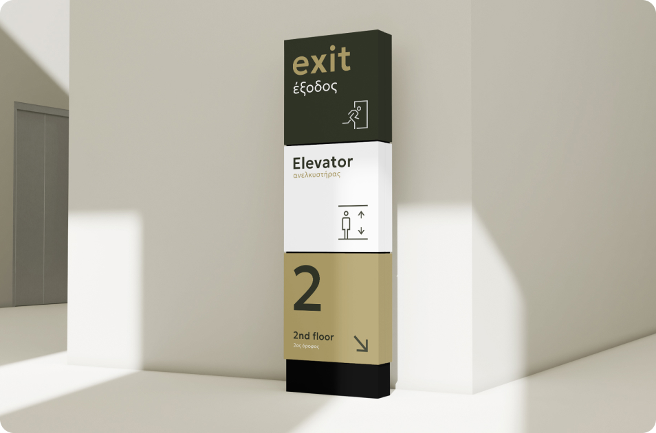
For the typography, it was crucial to choose a font that ensures that every piece of information, no matter how detailed, is always easy to understand and accessible to everyone. That’s why we introduced the Geologica font both for its modern look and readability at even the smallest sizes.

A tangible vision
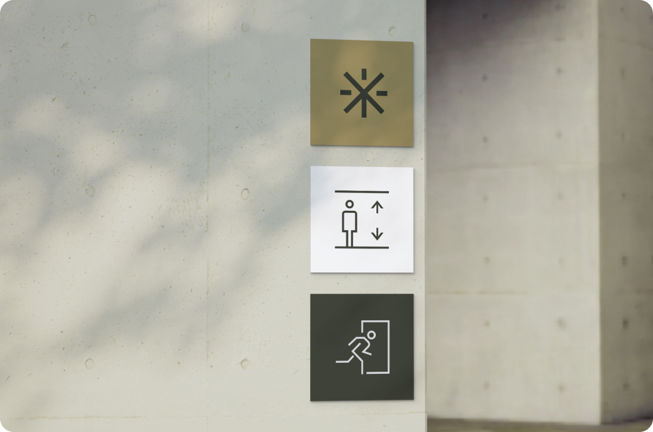
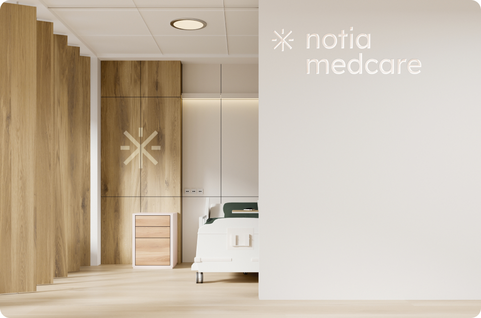
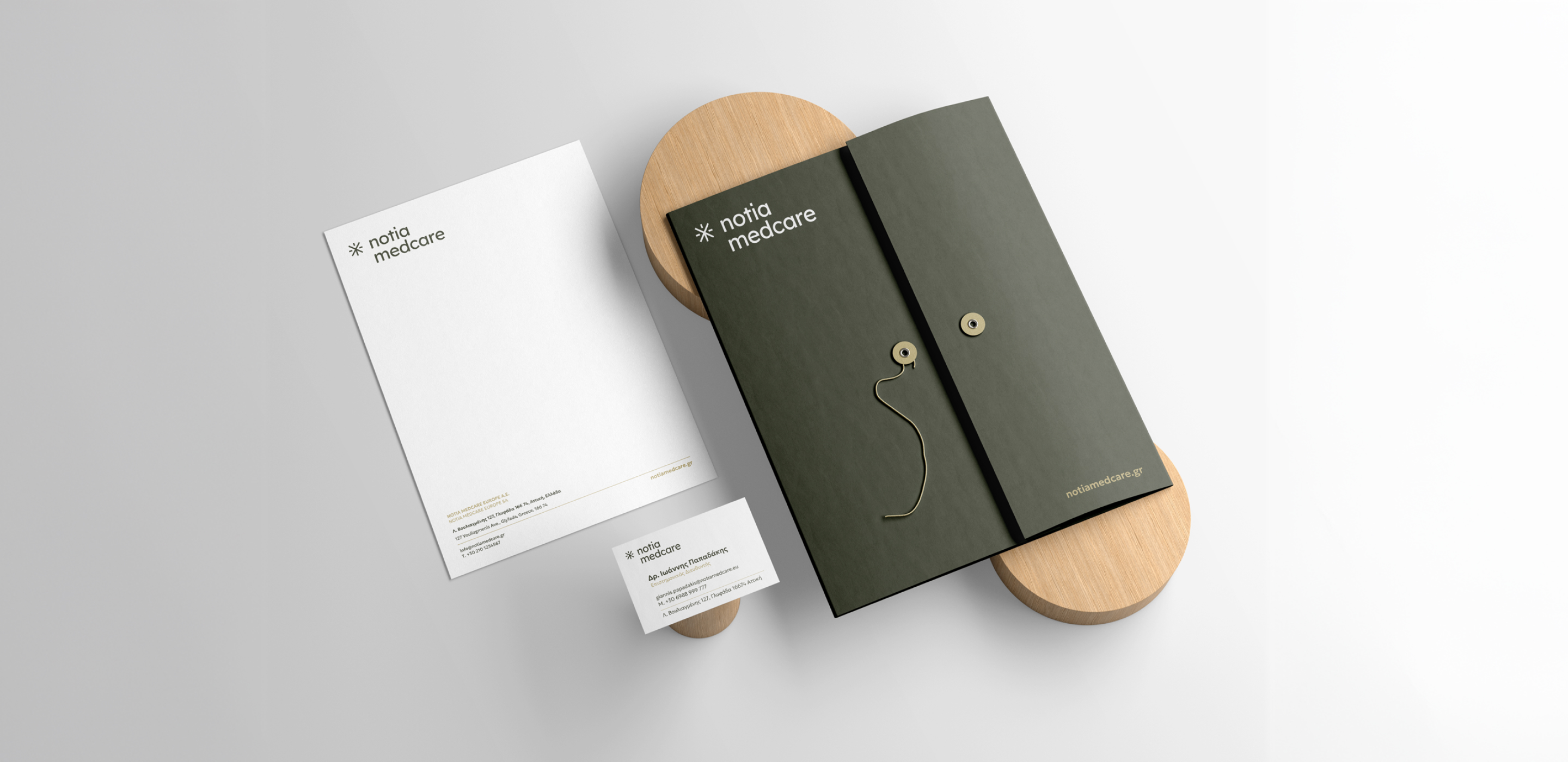
The result was a design that finally reflected everything Notia Medcare stands for: innovation, luxury and nature, all in a way that feels trustworthy and approachable. The implementation across the overall look and feel, including branding applications, signage, and social media, created a new universe for the clinic to progress and thrive. This inspiring, creative journey reached its destination by turning a vision of longevity into a contemporary visual language.
The new look & feel:
How the visual identity was brought to life