Building a New Social Media Visual Language for Diaverum Global
How we evolved Diaverum’s social media presence into a warmer, more distinctive and cohesive expression of the brand.
Background
Diaverum is a Swedish-born global healthcare organisation and one of the world’s leading providers of renal care, supporting around 45,000 people with chronic kidney disease across 460 clinics in 25 countries. Driven by the belief that everyone deserves a fulfilling life, Diaverum combines high-quality, patient-centred care with digital innovation and a strong culture of empathy, with the ambition to transform renal care and empower patients to live fuller lives.
The Challenge
Our challenge was to evolve Diaverum Global’s social media presence into a more distinctive and consistent expression of the brand. The goal was to strengthen visual recognition across a broad and diverse content ecosystem, while ensuring that every communication remained credible and reassuring within the healthcare environment.
Creating The
Visual Language
At the heart of the new social media direction was a careful balance: making Diaverum feel fresher and more contemporary while preserving the trust expected from a global healthcare brand.
Natural light, warmer tones and a sense of cinematic calm created a softer visual world across photography and video, bringing greater continuity and optimism to the brand’s social presence.

The Design System
The Colors
Following the visual direction we set out to create, we expanded Diaverum’s primary colors with a secondary palette of subtle tones. Together, they bring greater warmth and calm to the brand’s social media presence while remaining grounded in its established identity.

The Shapes
We reimagined Diaverum’s existing shapes as a modular design language, turning them from decorative elements into flexible building blocks. Their combinations allow us to create emphasis and visual rhythm, adapting naturally to the needs of each piece of content.

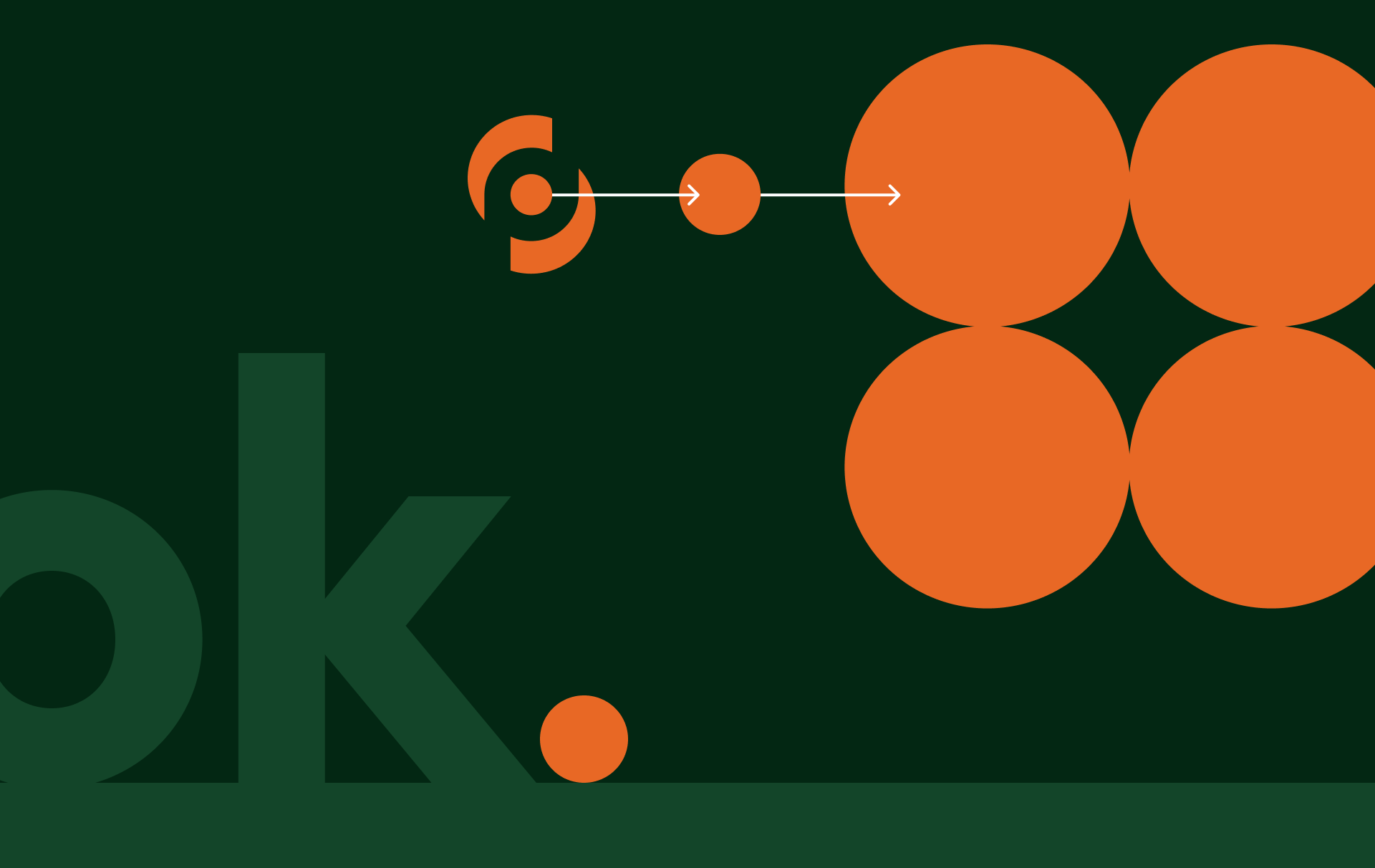
Orange dot at a scale
We isolated the circle within the Diaverum logo and expanded it into a recurring visual element. Used mainly in the background, it creates a subtle sense of continuity across the social content.
Orange dot as
a statement marker
The Orange Dot functions as a bold visual full stop, punctuating each key phrase with confidence.
Consistently placed at the end of the statement, it signals closure, certainty, and emphasis in a minimal yet impactful way.
The use of orange introduces a clear brand accent, ensuring recognisability while keeping the composition clean and focused.
The Outcome
The result is a social media identity that gives Diaverum greater creative freedom within a clear and consistent framework. Its flexible visual language brings diverse content together under one recognisable expression, creating a strong foundation for the brand’s continued evolution across social.